How to Read Crypto Charts as a Beginner?
As a beginner, looking at a crypto chart and trying to make sense of it can be scary. But whether you wanna day trade or swing trade, reading charts is an essential skill you must learn sooner or later.
The good news is it’s not as complicated as you might think it is. Understanding the basics can help you overcome the initial fear and give you the much-needed push to dive deeper into technical analysis. And that’s what you’ll learn in this guide.
What is a Crypto Chart?
Chances are, you’ve probably seen one of these before and know what it looks like.
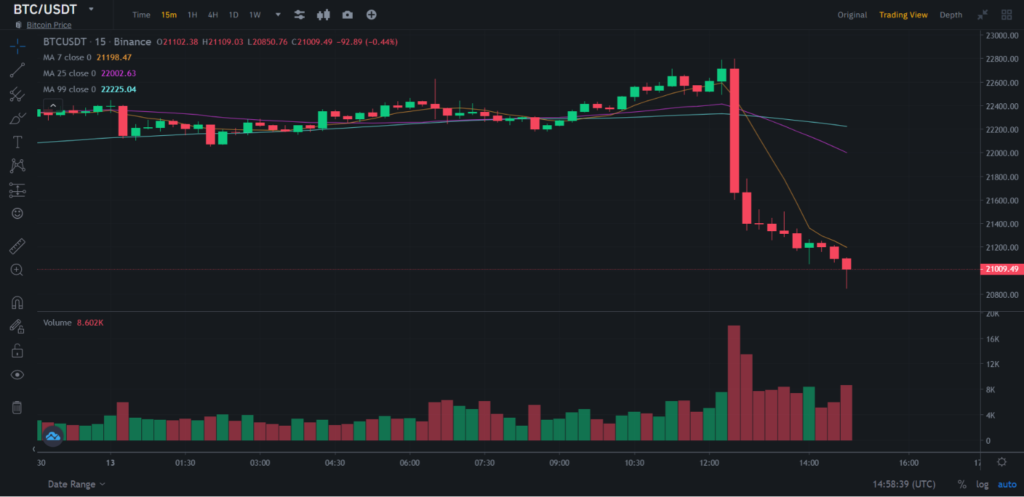
As you can see, it shows the historical price trends and trading volume of a trading pair. These trends may represent the price movements of the last seven days, one hour or even a minute.
Think of crypto charts as a canvas. On their own, they are not all that helpful. But you can use tools and indicators on top of this that help you find and identify patterns. These patterns then help you predict future prices and make a profit.
Elements of a Crypto Chart
Much like you learn in your third-grade math class, crypto charts have an x-axis representing time and a y-axis representing price. Other than that, there are a few other elements present that you must understand.
Trading Pair
Trading pairs allow you to trade one crypto asset for another. So, instead of trading Bitcoin for US dollars, you can trade Bitcoin for Ethereum, or more realistically, Bitcoin for USDT, which is a stablecoin.
As the name suggests, the price of stablecoins hardly, if ever, fluctuates. It’s because the value of these stablecoins, especially USDT, is pegged to the US dollar. So, 1 USDT will always be equal to 1 USD.
Usually, people convert their trading money into stablecoins to pay fewer fees and avoid tax complications.
Timescale
The timescale represents the time interval for the price trends. So, you can see the price trends for the last five minutes or the last month. It’s up to you and your strategies and habits.
Trading Volume
Trading volume is what you see in the bottom of the crypto chart. It represents the amount of transactions taking place for a trading pair.
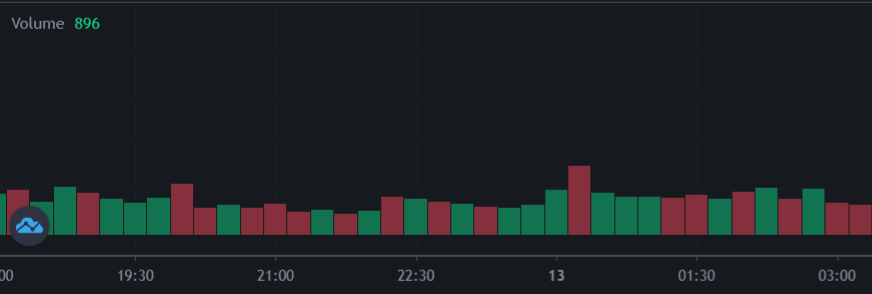
Trading volume is really important as it often correlates with price trends. For example, high trading volume may correlate with high prices, signaling a bullish trend. Similarly, low trading volume may correlate with low prices, signaling a bearish trend.
Understanding Candlesticks
This is where things start getting interesting. Candlesticks in crypto charts are called candlesticks because, as you can see, they look like one. But everything from its color to the small wick on top represents something.
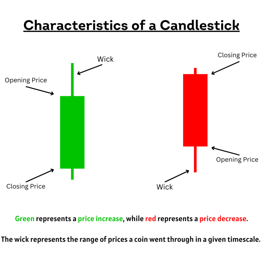
Firstly, each end of the candlestick represents an opening price (the price it was trading for when the time window started) and a closing price (the price it was trading for when the time window ended). The opening and closing price is determined based on the timescale you chose.
But how do you know which end represents what? Well, that depends on the color of the candlestick.
In a green candlestick, the lower end represents the opening price, while the upper end represents the closing price. Similarly, in a red candlestick, the lower end represents the closing price, while the upper end represents the opening price.
As you can guess by this, green represents a price increase, while red represents a price decrease.
Now, the wick.
The wick represents the range of prices a coin went through in a given timescale.
So, even if the closing price of a cryptocurrency in a 5-minute timescale is $500, that doesn’t eliminate the possibility that it was trading for more than $500 during the 5-minute time window. It just means the crypto was trading for $500 when the time window ended.
In a green candlestick, the wick represents the highest price a coin was trading for, while in a red candlestick, it represents the lowest price.
The wicks of candlesticks in crypto charts are a great help in predicting future trends. For example, if the wick in a green candlestick is short, it tells us that the trade ended close to its highest price.
On the other hand, if the wick is too long, it suggests that at some point, the crypto was selling for much higher prices, but people started selling (most probably to make a profit). Hence the closing price is far from the wick.
Similarly, if the wick on a red candlestick is short, it suggests that prices may drop further. But if it’s too long, it tells us the price reached its support level at some point. Hence, the closing price was far from the wick.
Don’t know what support level means? Don’t worry. That’s what we’ll explain in the next section.
Nonetheless, this was just an overview of how these indicators are interpreted. You can draw countless combinations and interpretations from them, which you will once you get more advanced.
Understanding Support and Resistance Levels
Support levels are when there’s a significant price drop, which creates upward pressure (more people buying the asset), raising the price up.
Similarly, resistance levels are when the price is at its peak, which creates a downward pressure (more people selling the asset), driving the price down.
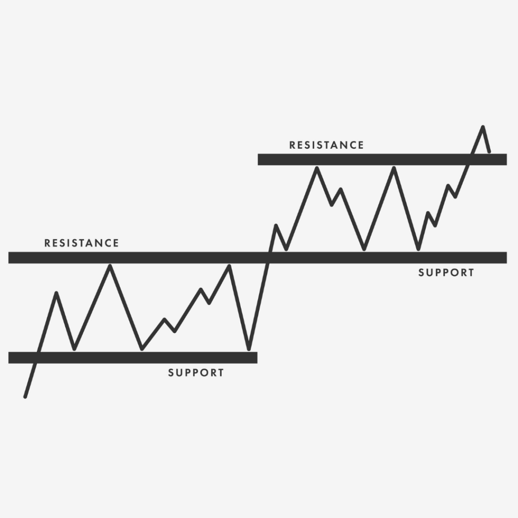
In other words, support levels are when the price of a crypto asset is at its lowest and can’t go any further down, while resistance levels are when the price is at its highest and can’t go any further up, only down (also called a pullback).
Generally, traders tend to buy at support levels and sell at resistance levels.
Trend Lines
Trend lines are pretty simple. They are straight lines in crypto charts that you can draw yourself to highlight a series of lows or highs. It helps in identifying and highlighting support and resistance levels.
Understanding Moving Averages
Moving averages represent the average closing price of a particular cryptocurrency in a given time frame (different from the main timescale). So, if you choose a 50-day moving average of Bitcoin, the chart will show you the average closing price of Bitcoin over the last 50 days.
Moving averages is one of the most fundamental indicators in crypto charts that traders start with. It helps them see how a particular cryptocurrency is performing compared to its performance in the last 50 days. You can, of course, change the time period to whatever you prefer, whether 90 days or 200 days. Not only that, but you can also have multiple moving averages in a single chart.
If a short-term moving average crosses over a long-term moving average on an upward trend, it’s called a golden cross and is a signal for a bullish market. The opposite of this is called a death cross, which signals a bearish market.
Final Thoughts
If all of this was overwhelming for you, understand that these are just the basics. We haven’t even fully scratched the surface. Not saying this to discourage or scare you but to help you understand that technical analysis, as the name suggests, is very technical.
People with more of an analytical and logical brain will find reading charts not all that difficult. But for people with more of a creative, unorganized and not-so-logical brain, it can be very challenging. That’s why many people prefer HODLing, as long-term investment strategies require more fundamental analysis.
Check out the differences between technical analysis and fundamental analysis.
Nonetheless, whether you’re someone with more of an analytical or creative brain, anyone can learn to read crypto charts. The key is practice and patience, as with learning any other skill. It may seem daunting at first, but once you keep the fear aside and actually start playing with different tools and indicators, it gets much easier.